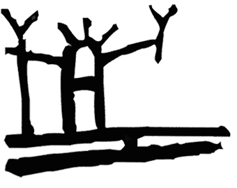
The Lappish Shaman's
ArtiKa Springwater symbol
2 of 24
Client: Alko Oy / Räjamäki Food Unit
Place: Helsinki, Finland
Year: 1994
Highlights:
In 1994 I designed this symbol
for the label designs I proposed to ALKO
(the Finnish alcohol monopoly) for its premium spring water bottled in
Rajamäki, Finland.
I
based my design on Lappish mythology and rupestrial paintings found on rocks and cliffs' walls in Lapland. It depicts a reindeer eating on the slopes of Lapland.
Together with a colleague, Dan Britse
(a Swedish industrial designer), I suggested to ALKO and Ogilvy Helsinki 5 names to brand the product, among them:
Arctica (also Artika) and Pure Nordic.
When we presented the dummies for labels and mockups for bottles, together with a list of potential brand names, our suggestion to Ogilvy Moscow was to test
the potential names only using a neutral typeface, without presenting any sort of designs of logos, symbols, labels, nor bottles, in order to avoid interfering with the tested people's real preferences for
a connotational and euphonious name.
After the survey with focus groups in
Saint Petersbourgh and Moscow, Ogilvy Moscow found out that the preferred name for the springwater was Artika, one of the names suggested in the list we presented to both Ogilvy Helsinki and Ogilvy Moscow. The survey also helped to discover that the bottles we suggested were "too elegant" (wine-like bottles) to the eyes of the Russian market. Therefore, both bottle and label simply remained in the unsuccessful projects' drawer.