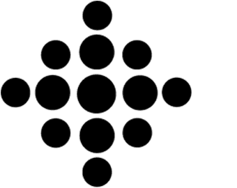
Kaute symbol
15 of 24
Client: Kaute
Place: Helsinki, Finland
Year: 1996
Highlights:
The KAUTE Symbol design is based on four ellipses which are an abstract representation of high-tech friendlyÐhuman oriented organisation, which provides support to the knowledge (research) in Finland for a global World, all central statements in KAUTE's philosophy.
The main idea with this design was to have a very flexible Symbol than can be easily integrated to any media, both traditional printed media (newspapers and magazines, brochures, stationery, vehicles, signage systems and so on) and new media.
Like the Logotype, the KAUTE Symbol reflects the corporate characteristics of the organisation: Dynamics, Friendliness, Support (to research), Up-to-date Organisation, Reliability, Efficiency, Teamwork, Integrity and Flexibility.
The Symbol can work individually or integrated to the linguistic representation
of the trademark, the Logotype.
Blue is the colour proposed, which makes it adaptable to any printed and digital media, at a low cost.
The keywords contained in the psychology of the colour are:
Satisfaction, Relaxed sensitivity, Confidential friendship, Cleanliness, Universal and Intellectuality.