
Management Support
Corporate Identity
5 of 8
Client: Management Support
Place: Brussels, Belgium
Year: 2003
Highlights:
Background.
Management Support is a Belgian management consulting organisation established in 2003 that offers executives support in their managerial functions.
Assignment.
In summer 2003 I was appointed to design Management Support’s corporate identity.
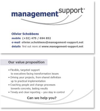
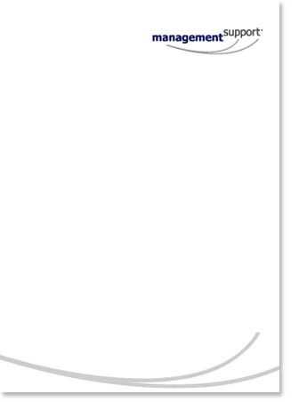
The request was to design a mark and implement it to basic stationary.
Approach.
With the design brief in place I started my visual researched by looking for an abstract element that could depict a sense of expertise, knowledgeable support and reliability.
Working with principle, I sought to explore various typographic solutions that could perfectly integrate to the chosen
iconographic solution for the Management Support’s identity. At the end I came out with a mark conformed by two elements: symbol and logotype.
For the symbol I have used curved lines (one line transformed in two lines representing an abstract element) that act as a visual metaphor of both a bridge and
a friendly-extended hand holding the logotype, lifting-up literally the word Support, thus emphasising the idea of reliable help and advice.
For the logotype, I began working with various fonts. After looking at both serif and sans serif solutions I narrowed down the choices to sans serif. The final logotype uses Tahoma regular and bold, I chose it for its readability and legibility as well for its elegant design. In order to provide Management Support with a friendly and flexible logotype I use only lower-case characters, increasing the size and weight (bold) of the word management, whereas the word support is smaller and thinner (regular) to connote the flexibility and ease of the company’s services.
The colours used on the identity are Grey and Blue. Grey for the symbol and both Blue and grey for the logotype, conformed by two words: management and support.
Blue is used to connote the trustworthy, flexibility and friendly people-minded Management Support’s services.
Grey, a neutral colour connotes a solid, pragmatic, honest and mature organisation,that looks to keep a firm eye on the future. by focusing on its customers’ objectives, building bridges
towards solutions.
Outcome.
The identity developed is consistent and flexible. The mark (both symbol and logotype) follow a simple and elegant design, the symbol is an abstraction of a
sui generis bridge and a flexible friendly-extended hand, which describes Management Support’s core values.
The mark was used in basic stationary, as well as in Management Support’s website.