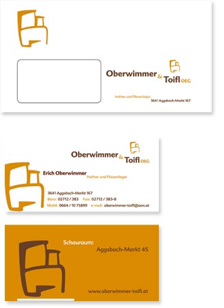
Oberwimmer und Toifl Corporate Identity
8 of 8
Client: Oberwimmer und Toifl
Place: Aggsbach, Austria
Year: 2002
Highlights:
Background.
Oberwimmer und Toifl is a company established in 2002, their speciality is the design and construction of tiled stoves
and floors.
Assignment.
In spring 2002 I was appointed to design Oberwimmer und Toifl’s corporate identity.
The initial request was to design a mark and a website. After consulting the client
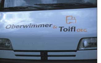
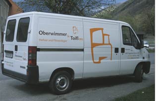
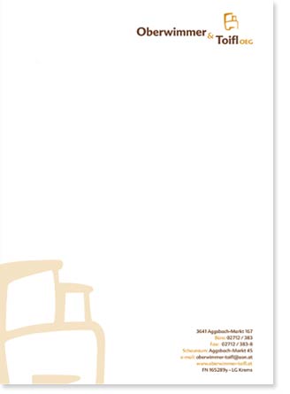
it was defined the need for a brief implementation of the mark to basic stationary, facade, vehicle and website.
I was asked to design their website too.
Approach.
Working with principle, I sought to explore various typographic and iconographic solutions to this Austrian company’s
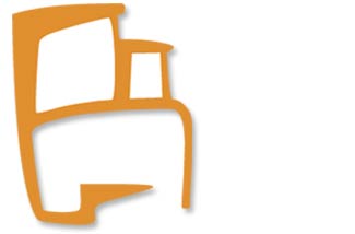
identity. I came out with a two elemnents mark (using a symbol that depicts an outlined tiled stove and a logotype, that is a typographic solution) and then I began working with various fonts.
After looking at both serif and sans serif solutions I narrowed down the choices to sans serif. The final logo uses Advert regular and bold.
The institutional typography is also Advert. In the website it is used in the navigational button, whereas the content uses Verdana.
The colours used on the identity are Brown and Orange. Orange for the symbol and both orange and brown for the logotype. Orange is used to connote the warm feeling that the tiled stoves, designed and build by Oberwimmer und Toifl provide.
It also depicts the friendly service, full of energy and and precision, just as the presence of the sun itself.
Brown connotes a trustworthy company,
full of know-how and experience (mature as a grown up tree or solid as the Earth).
For the website once the static version of the symbol was finalised, an animated version was created. The animated version was used as an introduction screen in
the Oberwimmer und Toifl website's homepage. The site is offline.
Outcome.
The identity developed is simple, easy to read, flexible and lends itself well to the interactive (animated) version, especially the symbol. The mark (both symbol and logotype) followed a simple and clean design, the symbol is an abstraction of a tiled stove, which describes the main product offered by Oberwimmer und Toifl.
Graphically speaking the symbol is made out of organic lines, that visually integrate to the logotype thus presenting a single and uniform mark.
The mark was used in vehicles,
showroom’s facade, basic stationary system and collateral materials, as well as in
the website.