ELA Identity
2 of 8
Client: Espacio Latinoamericano asbl
Place: Brussels, Belgium
Year: 2004
Highlights:
Background.
ELA Espacio Latinoamericano is a Belgian institution conformed by the Latin-American community living in Belgium.
Its mission is to join culturally, economically and socially the
Latin-American society with the Belgian community in Belgium, through both the organisation and promotion of cultural events, exhibitions, conferences, workshops, fairs and the like.
Assignment.
In autumn 2004 I was appointed to design ELA’s corporate identity.
The initial request was to design a mark and implement it to brochures and posters. After consulting the client I found out the need for a deeper work, so I started the quest for the organisation’s core values in order to develop its corporate identity as
a second step. First I performed a mood-board session and then together with a focus group discovered with a list of shared core values that worked as the cornerstone for the visual research.
Approach.
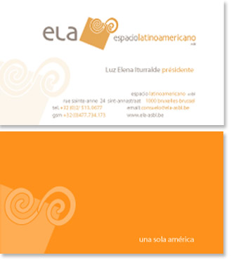
With the core values in place I synthesised them into a compact slogan: “Hacia una sola America” (Towards a single America), based on the need to unify the interests and presence of the Latin-American community in Belgium. I started my visual researched by looking for a common element that could depict a sense of cohesive and holistic presence in Belgium while being American, that is a member of the same and single continent called America. I discovered a graphical element, a pre-hispanic symbol present all over the continent since almost 5000 years ago, from Canada until Tierra The Patagonia, present in pyramids, vases, seals, ceramics, textiles and codex’s, a symbol that bound the whole peoples of America, from Pueblo people, to Aztec, Olmec, Toltec, Teotihuacan, Maya, Inca, Guarani, Pamayo, Mapuche peoples, and
so on, such element was a double spiral
in nahuatl known by the Aztecs as the Xonecuilli (the Blue Warm),
which symbolises the thunder and the
Mother of Fertility: life.
Working with principle, I sought to explore various typographic solutions that could perfectly integrate to the chosen
iconographic solution for ELA’s identity.
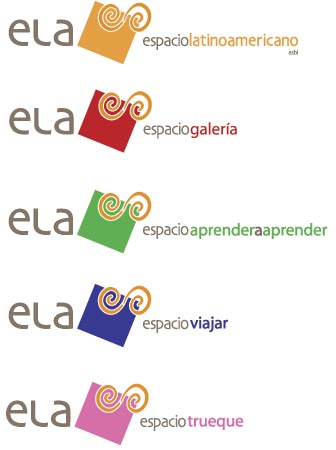
So I came out with a mark conformed by two elements: symbol and logotype.
For the symbol I have used two elements, one the Xonecuilli, the other one a square representing an abstract element, which
communicates the idea of an Espacio (space, synonym of stage) Latinoamericano.
For the logotype, I began working with various fonts. After looking at both serif and sans serif solutions I narrowed down the choices to sans serif. The final logotype uses Loebas regular and bold, I chose it for its readability and legibility as well for its timeless design. In order to provide ELA’s mark with a unique visual presence I designed a distinctive letter L (which is inspired by the typographic structure of the Loebas font-case), and make then the lower case E and A appear as upper-case characters, thanks to the binding presence of the upper-case tailored L.
The institutional secondary typography used is Verdana. In the website Verdana is also used both in the navigational buttons as well in the content.
The colours used on the identity are Grey and Orange. Orange for the symbol and both orange and grey for the logotype,
conformed by two elements:
1. ELA, the acronym for Espacio latinoamericano.
2. The organisations’ official name itself:
Espacio latinoamericano.
Orange is used to connote the energetic, creative and friendly presence of the
Latin-American community in Belgium.
Grey, a neutral colour connotes a flexible and trustworthy organisation, willing and capable to successfully promote a cultural, economic and social exchange between Latin-Americans and Belgians living together in Belgium.
Outcome.
The identity developed is consistent and flexible. The mark (both symbol and logotype) follow a simple and clean design,
the symbol is an abstraction of a wide and flexible stage with strong cultural and historic roots , which resumes ELA’s
shared core values.
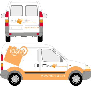
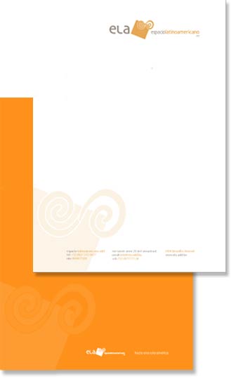
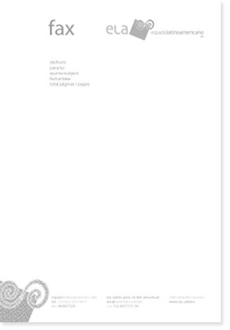
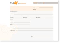
The mark was used in vehicles, ELA’s gallery and office’s facade, basic stationary system and collateral materials as well as in the GUI for ELA’s website.
In March 2006 ELA's identity was selected among the best corporate and brand identities for Non-profit organisations around the world in 2006 by the international Russioan magazine Identity, during the Best of Identity 2006 Contest.